There was a time, not that long ago, when the No Logo slogan was all the rage. Brand names of factories that were considered –symbolically but no less terribly – responsible for all the evil in the world. Brands were torn down, physically and emblematically, wherever they were found: on billboards, in shop windows, on designer labels.
Some surreptitiously ripped the crocodiles off their Lacoste shirts, while others openly burned gas station signs or fast food chain restaurants hoardings. In a strange economic and cultural commingling, the Enemy was placed under a single umbrella: gas and oil multinationals were bundled together with nauseating hamburger joints, top-end glamor products with the most sought-after sneakers, not to mention the giants of the web with their industrial mentors. The G8 summit in Genoa, Italy, at the beginning of the new millennium was the involuntary funeral of the No Logo movement. Today, protestors gather at the mouths of the tunnels being dug through the Alps so that high-speed trains can race even faster along the new European trade routes.
There is still a deeply held suspicion, however, that those logos that we all display, whether we like it or not, those miniscule symbols inevitably exhibited on products of every kind, including the products of nature, are the depositaries of a fetishism behind which the capitalistic oppression of man lurks. This oppression was theorized two hundred years ago by a solitary genius with a bad reputation.
What do innocent logos have to do with oppression, one may well ask? Why rage against these blameless little symbols that hordes of graphic artists, advertisers, communication strategists and company directors propagate around the world for immediate exhibition, consumption, exhumation, interpretation and destruction without their having any say in the matter? There is an answer to the question, but it does not lie in Capitalism, nor its media avatar which is the Brand System. It lies in something very different, something which is both deeper and lighter. That is, the semiotic basis of images. As the great visual art critics, from Panofsky to Gombrich, and from Freedberg and Marin to Elkins, have always taught us, any image – be it artistic or not – before representing something of the world presents itself in the world. It is an object among other objects. It is not there just to say or to symbolize something, but to act, create, strike, and transform.
The notorious power of images lies in the fact that they are powerful in themselves, at times even overpowering. They often have the same power, if not a greater power, than conventional weapons. The pen is mightier than the sword, as they say. As a consequence, iconoclasts will always come to the fore. They obstinately oppose image/weapons. At times they succeed, at others they fail, but the conflict they trigger is an all-out war. Those who lose are not the images, but we who create them, look at them, are subjected to them, and tolerate them with ill-concealed irritation.
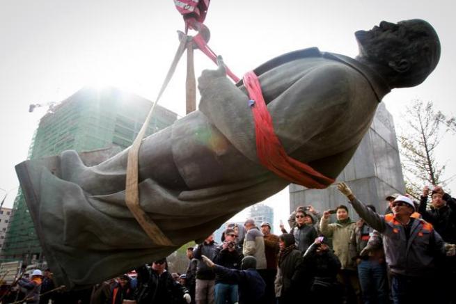
The most recent iconoclastic movement was the No Logo movement. It was similar in its actions and intended results to the uprisings that destroyed statues of saints in churches during the French Revolution, tore down statues of Lenin or Stalin in public squares after the fall of the Berlin Wall, or pulverized the statues of Buddha in the Afghan caves under the Taliban regime. Maurizio Cattelan’s provocations are improvisations in comparison.
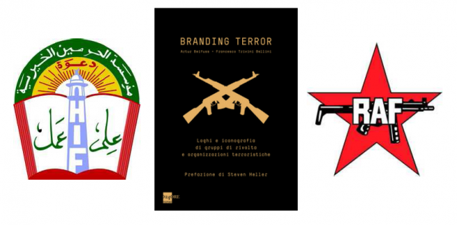
This is all to say that a book has just come out that will no doubt please Naomi Klein. After her ‘No Logo’ became the bible of the No-Global movement, her fans, iconoclastic ghosts wandering around Europe and further afield, continue to follow her example. The book, Branding Terror: The Logotypes and Iconography of Insurgent Groups and Terrorist Organizations by Artur Beifuss and Francesco Trivini (preface by Stephen Heller, Merrell Holberton, 2013) is published in Italy – and it is no coincidence - by the Confederation of Industrialists’ daily, Sole 24 Ore. It is a complete collection of the brands of terrorist groups around the world, from Al-Qaeda to the P.L.O., from the Tamil Tigers to the home-grown Italian Red Brigades.
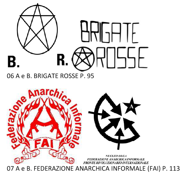
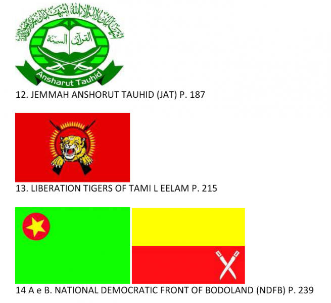
It briefly reconstructs the history of the myriad organizations, groups and factions, and displays their logos alongside each and every one of them, outlining their graphic and symbolic features. It is a veritable treasure-trove of semiotics, along the same lines as a post launched a few years ago by David Friedman in his blog, ‘Ironic Sans’ (Terrorist Organization Logos, July 9, 2007).
In the Introduction to the book, Beifuss tells us why compiling this anthology of terrorist brand names, with the pithy, subversive clarity of their images, was worthwhile and interesting. Terrorists, he states, incarnate a process of communication. Not only do they rely on the media but they exist because the media pre-exists them and has somehow contributed to generating their existence. A terrorist attack is not just an act of violence. It is a sign, with precise promotional signifiers within a certain ideology. This means, for example – though it is terrible to say it – that Anders Breivik’s attack on government buildings in Oslo, and subsequent fatal shootings at Utoya, could be interpreted as a striking media operation to launch his ‘political manifesto’, available for download the next day.
Thus, terrorist groups are producers of brands and logos, just like commercial ventures or government institutions. They need to manage them carefully, and sponsor their aims and goals by means of a communicative and promotional approach. Just like any other company, choosing a logo is not an optional. It is intrinsic to survival. As Heller says, these terrorist groups are brands, and they survive thanks to the methods linked to branding. Branding, Heller continues, has no conscience or morality of its own. It can be used for positive or negative ends, or even both together.
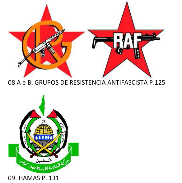
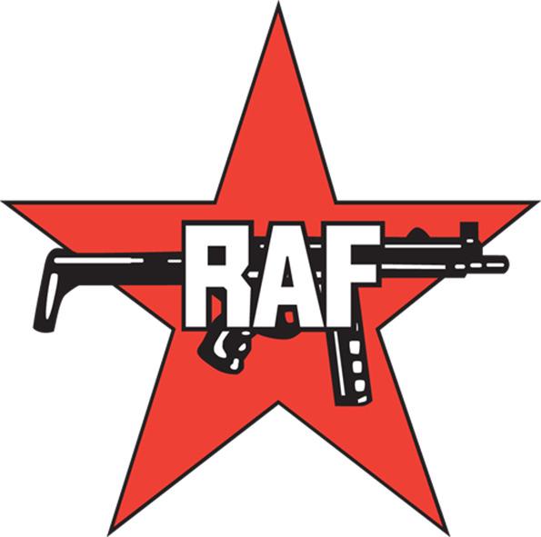
Just as every brand endeavors to eliminate any possible discrepancy between the identity it wishes to convey to its public, and public perception of its image, so terrorists must learn to use both their Kalashnikovs and the basic elements of Photo Shop Illustrator in order to manage the visual communication strategy of their particular armed faction. What are the results? Do they communicate well, or badly? Mostly the latter, I would say. The figurative, formal and chromatic repertory of the logos contained in the anthology is extremely poor. There are few images other than stars, flags, hammers and sickles, guns, crossed rifles, lighthouses, and letters. The only exception is the German Baader Meinhof group, whose symbols are extremely basic but graphically very strong.
A more in-depth study of the visual aspect of the material contained in the collection would, I am sure, unearth some surprises. At first glance, the impression is one of uniformity. Most of these terrorist logos look alike. However, a successful logo, as well as grabbing the attention of potential followers, should distinguish itself from its competitors, whether they are direct or indirect contenders. One of its main qualities should be its uniqueness. There is a strange contradiction between the vast number of different terrorist groups on the market (please forgive the term) and the repetition of a sign which is almost always the same. Could it be that they all have the same message?


 Since 2011